Logo for West African Cashew featuring orange and white text on a dark green circular background with a starburst design.

How to tell a story
in a second.

Some square inches are more consequential than others.

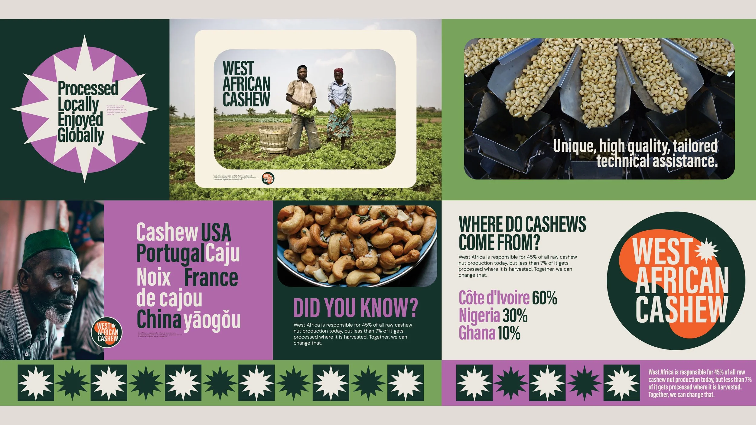
For West African Cashew, a new brand identity would carry the hopes of a regional industry. A stamp on a package to signal differentiation from a mass of other generic producers.

A man holding a basket of multicolored cashew apples in a cashew farm. A woman in the background pushes a cart filled with cashew apples. The sky is partly cloudy, and there are green cashew trees all around.
Infographic about cashew production highlighting West Africa as a major source, with images of farmers, cashew nuts, and processing methods. Includes statistics on origin countries and global production.
Four variations of a circular logo for 'West African Cashew' with different background and color styles.
Bright geometric pattern featuring stars and abstract shapes in orange, black, white, and dark green, with the words "West African Cashew" displayed in various areas.
Word cloud featuring country and region names such as Cashew, USA, Portugal, Caju, Noix, France, de cajou, China, YAOGOU in purple and white on a dark background. An orange starburst icon appears near the text.
Purple, white, and green packaging for West African Cashew nuts with a starburst graphic and informational text about local processing and global consumption.

A strategy in a shape.

This was a classic case of inspiration meeting insight. A deep strategic dive revealed that West African cashews had huge advantages for the US market over other cashews. That led to a new brand positioning, based in freshness, natural processes and pride. And that demanded a new identity.


Coincidence? Or brilliance?

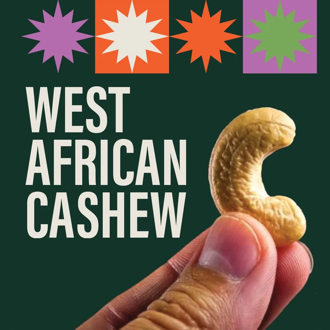
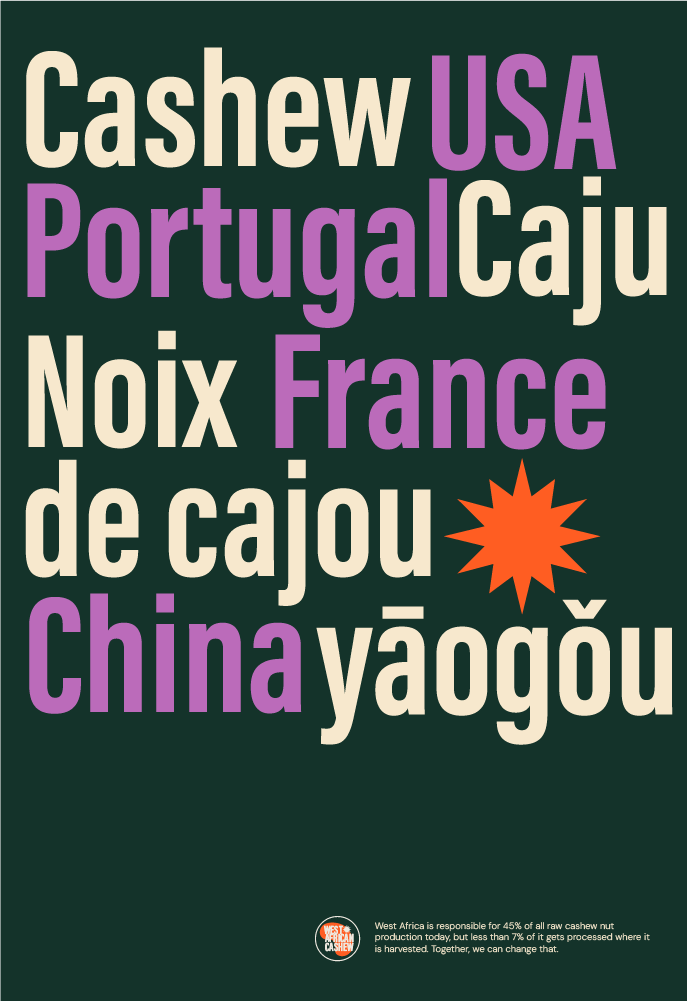
The logo contained a little of both. A design exploration of West African cultures and iconography inspired graphics and a color palette celebrating nature. And then the coincidence that every cashew is essentially the same shape as the continent that grew it, was too good to pass up.


A logo birthed a category.

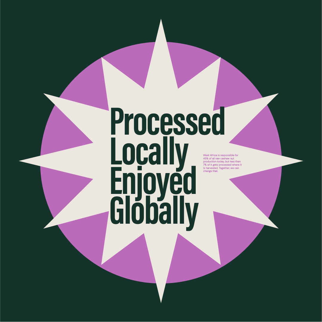
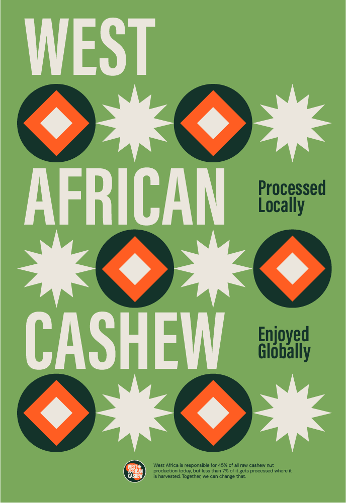
This would be a lifeline for local African producers. An identity to own, celebrate and leverage. Marketing would support it. Buyers would recognize it. The stage was set. Because, with one bold graphic solution, where there were once just cashews there were now West African cashews.


Close-up of a hand holding a raw cashew nut with a dark green background. Text reads 'West African Cashew' and decorative starburst icons at the top in purple, white, orange, and purple with green.
Collection of eight circular logos with African-inspired designs and text, set on a black background. The logos feature symbols like the sun, leaves, facial features, and tribal patterns, with some including the text "West African Cashew."
Poster for West African Cashew showcasing colorful star shapes and text highlighting local processing and global enjoyment.
A circular graphic with a purple outer ring and a white starburst in the center. Inside the starburst, the text reads 'Processed Locally Enjoyed Globally'. Small purple text in the bottom right mentions West Africa's cashew nut processing statistics.
Green poster promoting West African cashew nuts with white and orange geometric designs. Text highlights locally processed and globally enjoyed cashews, emphasizing West Africa's role in production.